Paul Rand wasn’t just designing logos—he was shaping the visual language of modern brands with a bold mix of simplicity, strategy, and timeless style that still influences designers today.


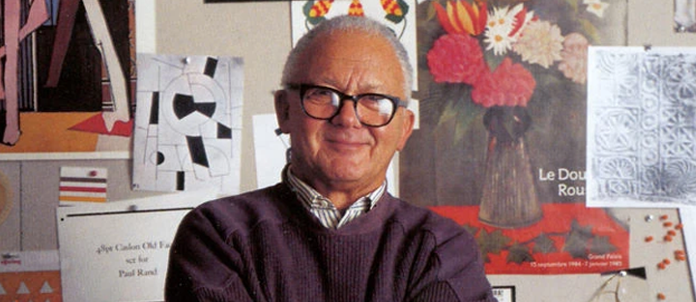
If graphic design had a Mount Rushmore, Paul Rand would be front and center, probably wearing thick black frames. Born in 1914, Rand helped shape what we now call modern corporate branding. He wasn’t just a designer—he was a philosopher of form, believing that a good logo should be both beautiful and functional. Think of him as the original "design thinker" before that was even a thing.
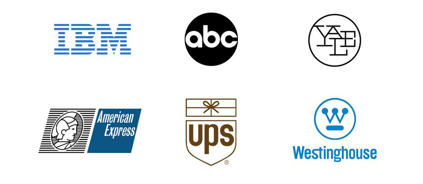
IBM. ABC. UPS. NeXT. If you’ve seen these logos, you’ve seen Paul Rand's fingerprints. What made his work so iconic wasn’t just the look—it was the logic. He believed that design is the silent ambassador of a brand. Rand’s logos weren’t trendy; they were timeless. They were built to last, and most of them still do.
Rand had no time for fluff. He championed simplicity—not because it was easy, but because it was effective. A Paul Rand logo is like a haiku: precise, clean, and deeply considered. He once said, “Design is so simple, that’s why it’s so complicated.” That quote alone could be a logo.
“Don’t try to be original. Just try to be good.” – Paul Rand
One of the coolest things about Rand? He didn’t just hand clients a logo—he gave them a presentation, a rationale, a story. When Steve Jobs hired him for the NeXT logo, Rand delivered a full booklet explaining every decision. His process taught generations of designers how to defend their work with thought, not just talent.
Even in our digital era of motion graphics and branding kits, Rand’s work holds up. Why? Because he understood the power of clarity. His legacy reminds designers to strip away the noise and focus on meaning. Whether you’re designing an app icon or a billboard, Rand’s philosophy still speaks: make it smart, make it simple, and make it stick.